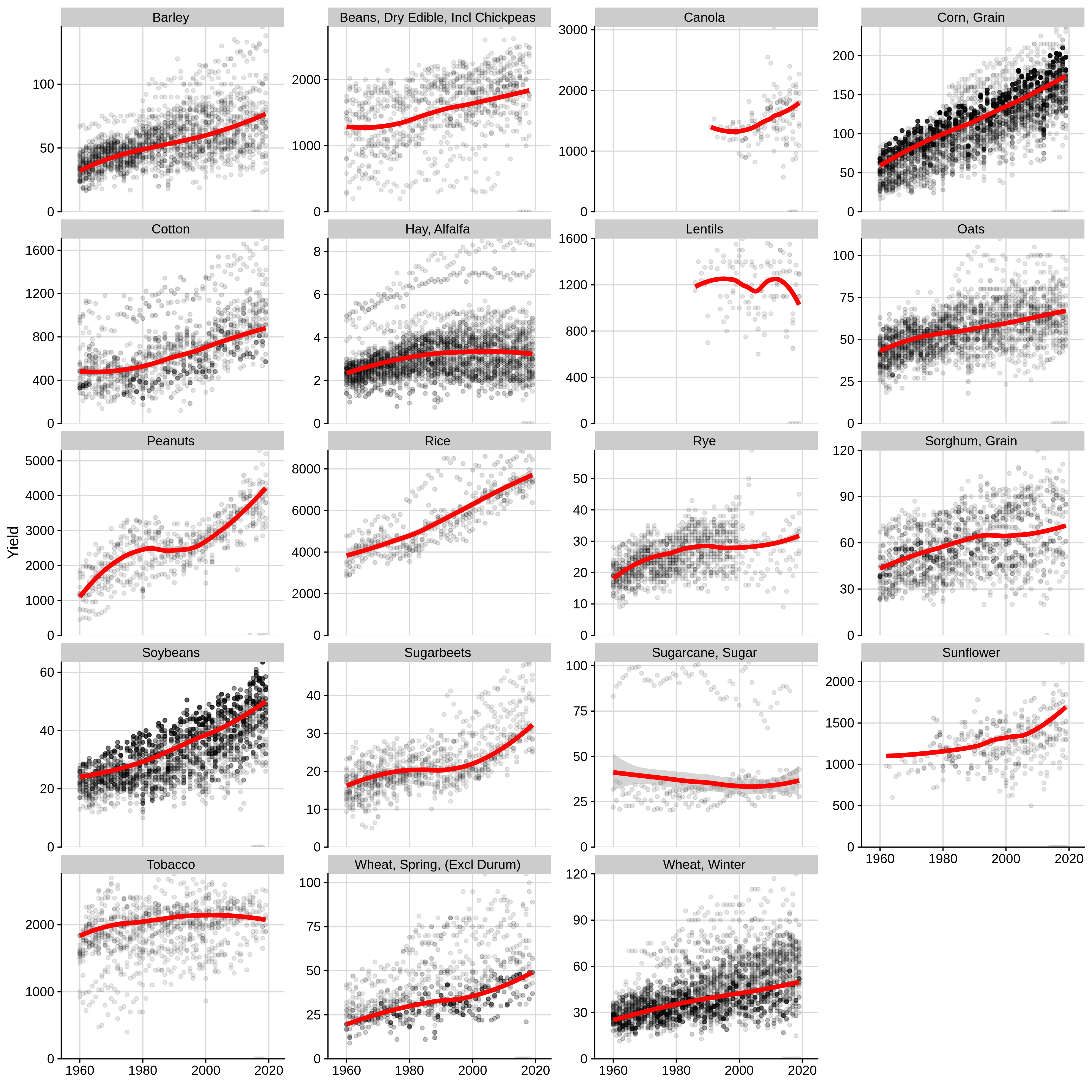
Each point represents crop yield from one state in one year. The transparency level indicates the number of acres produced; darker points mean more acres, and lighter points mean fewer acres. All data from USDA-NASS.
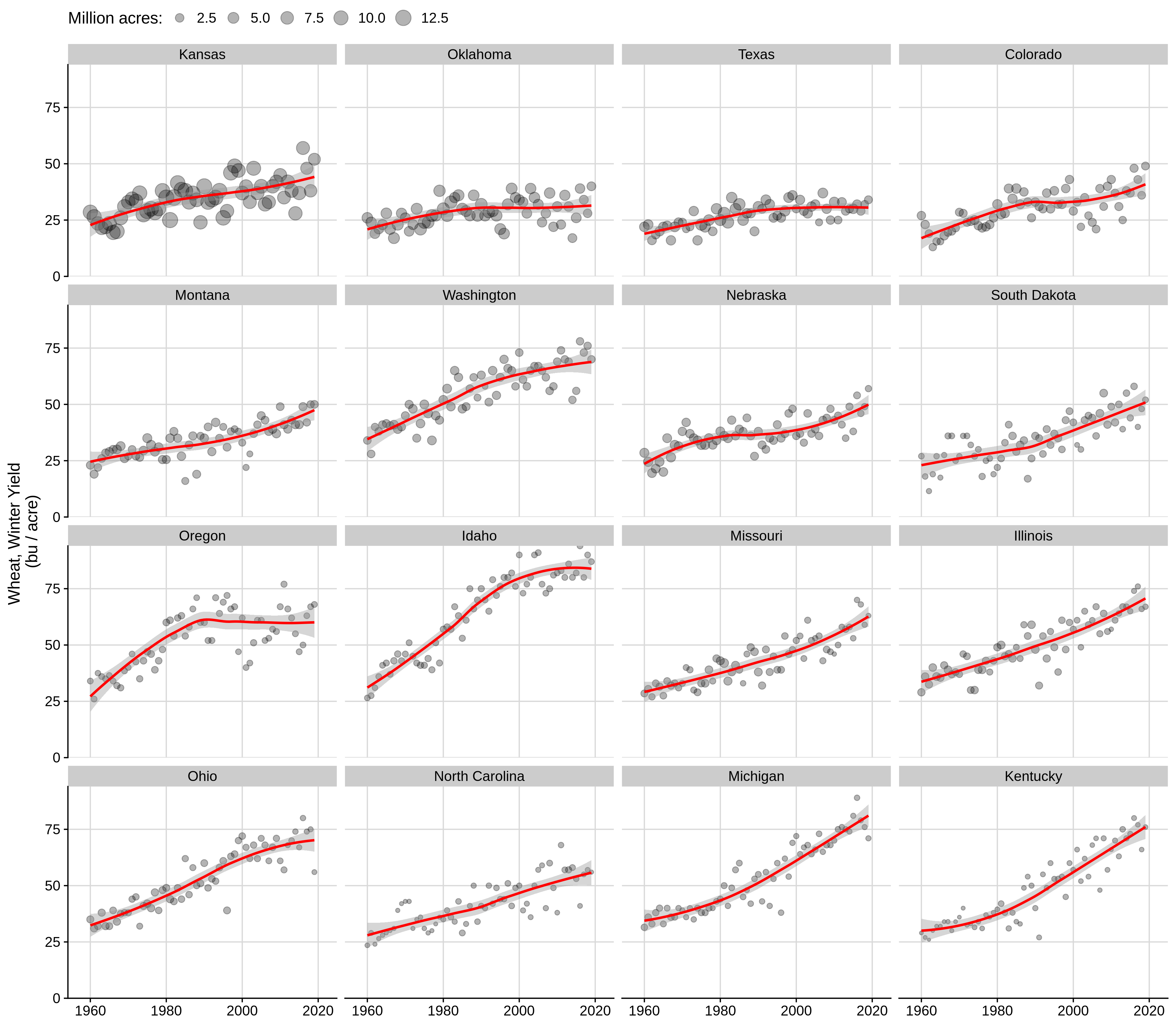
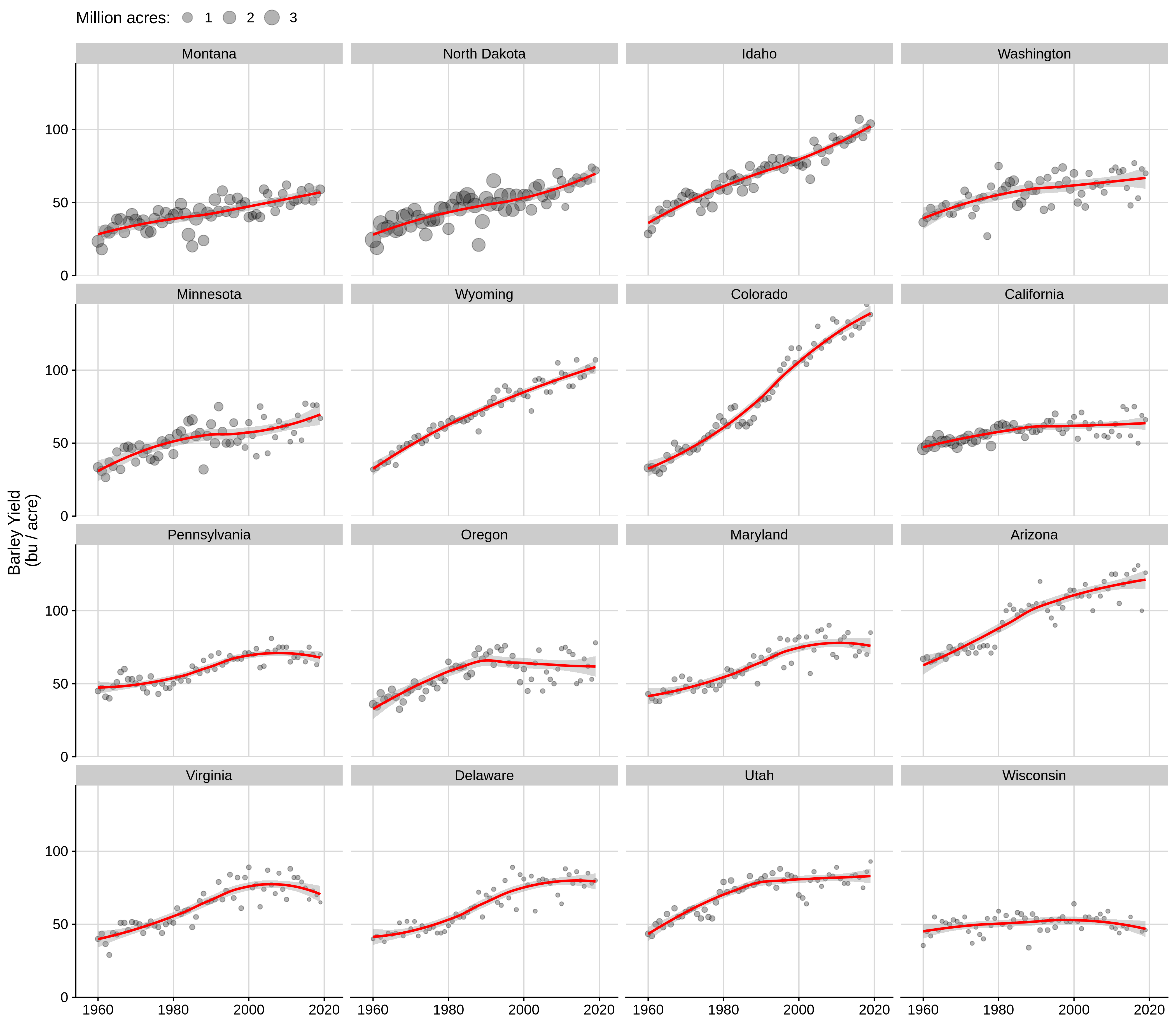
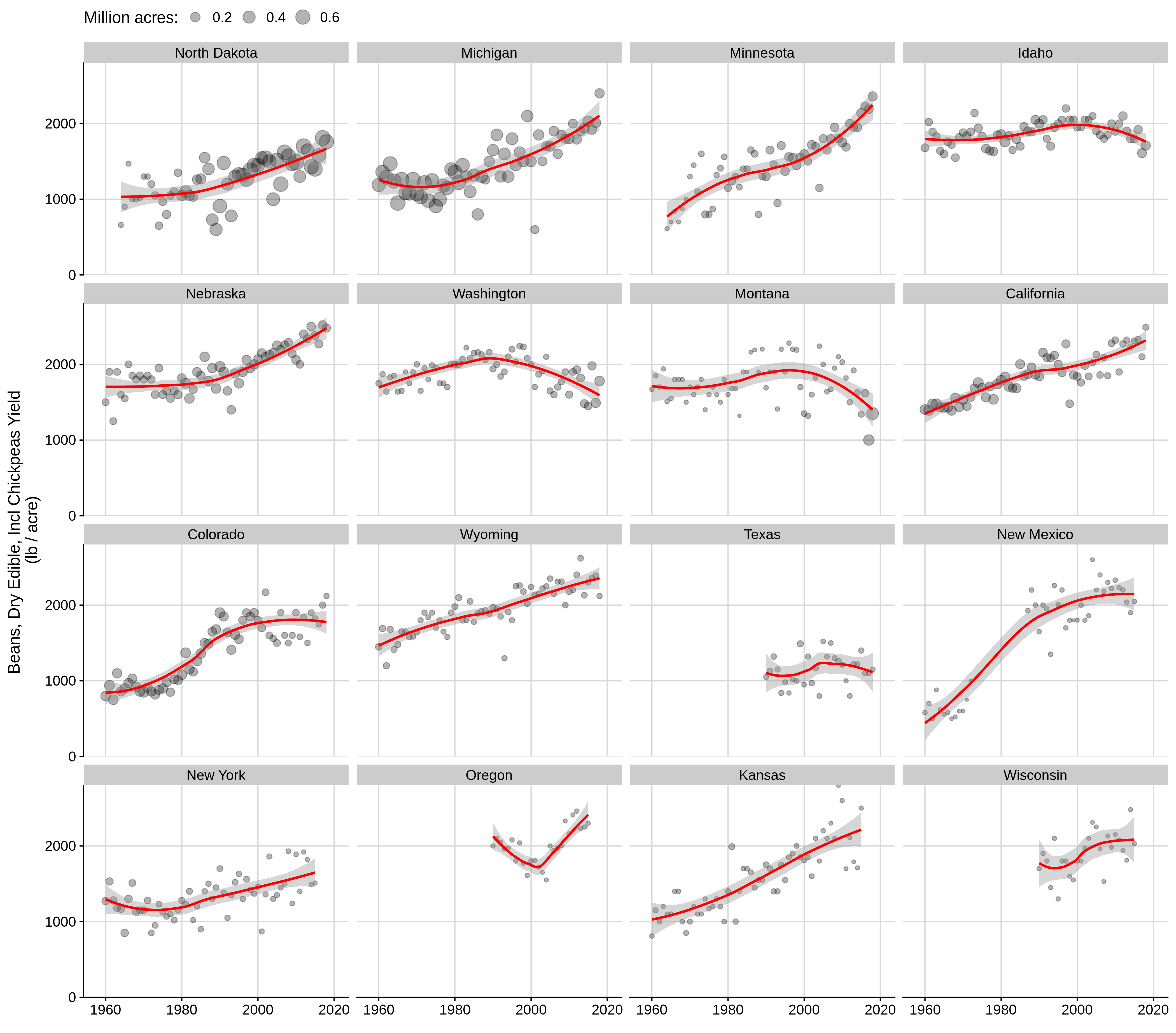
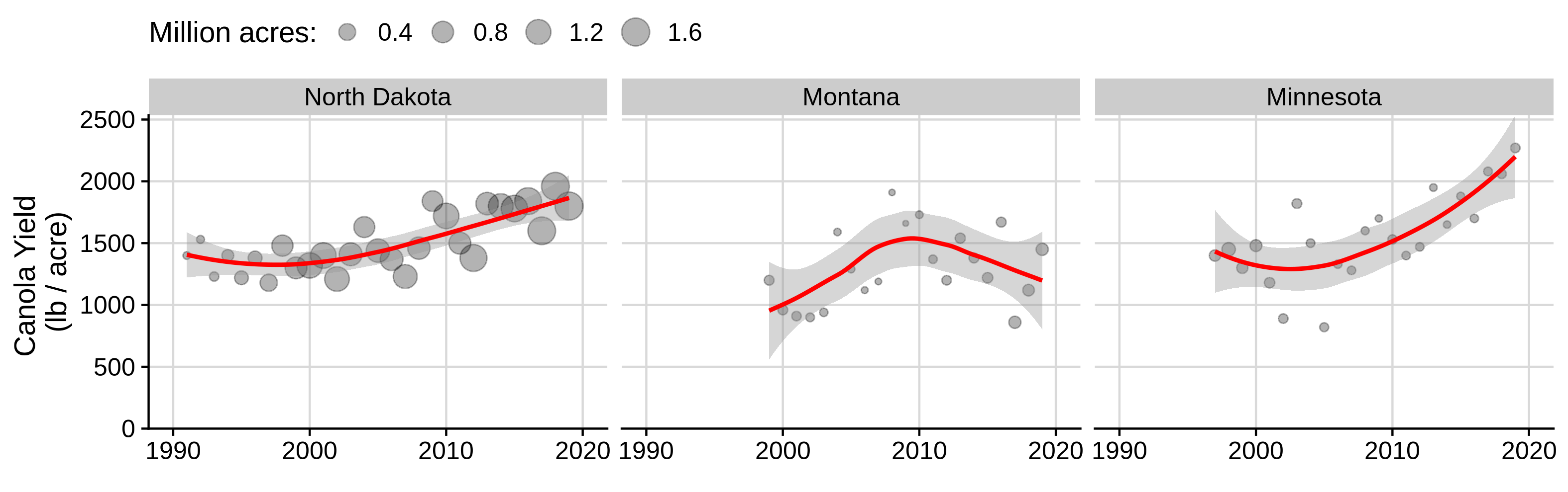
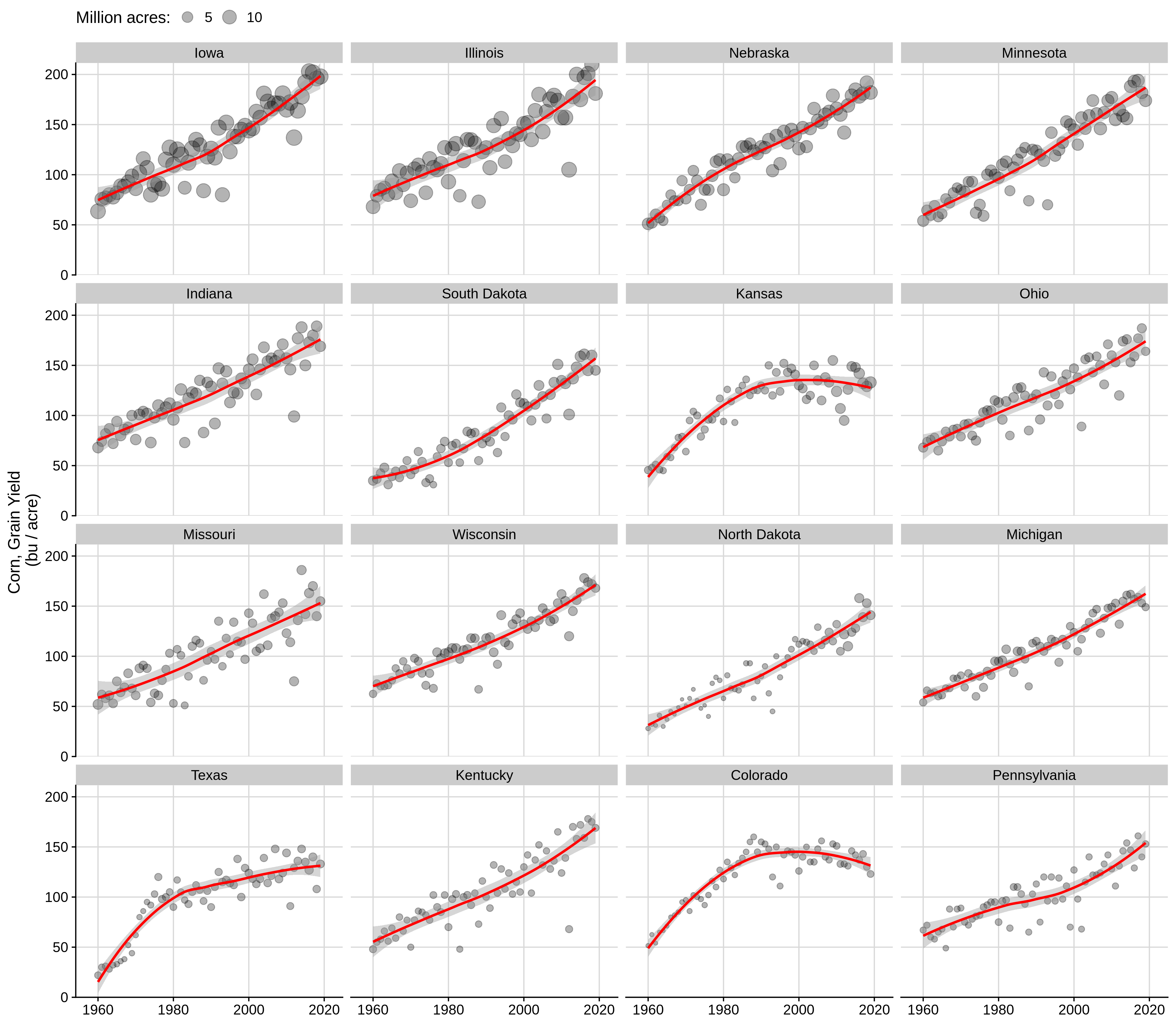
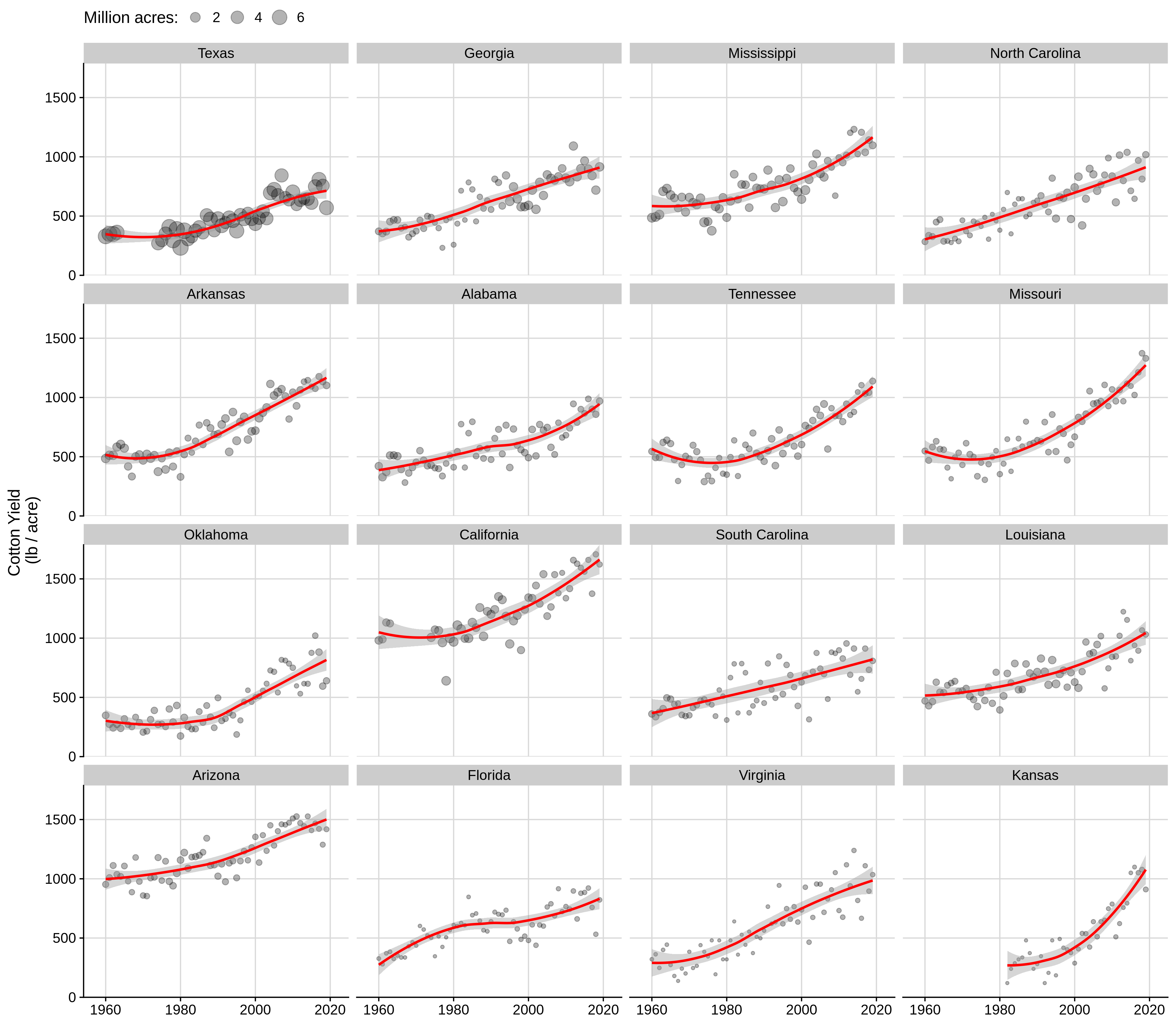
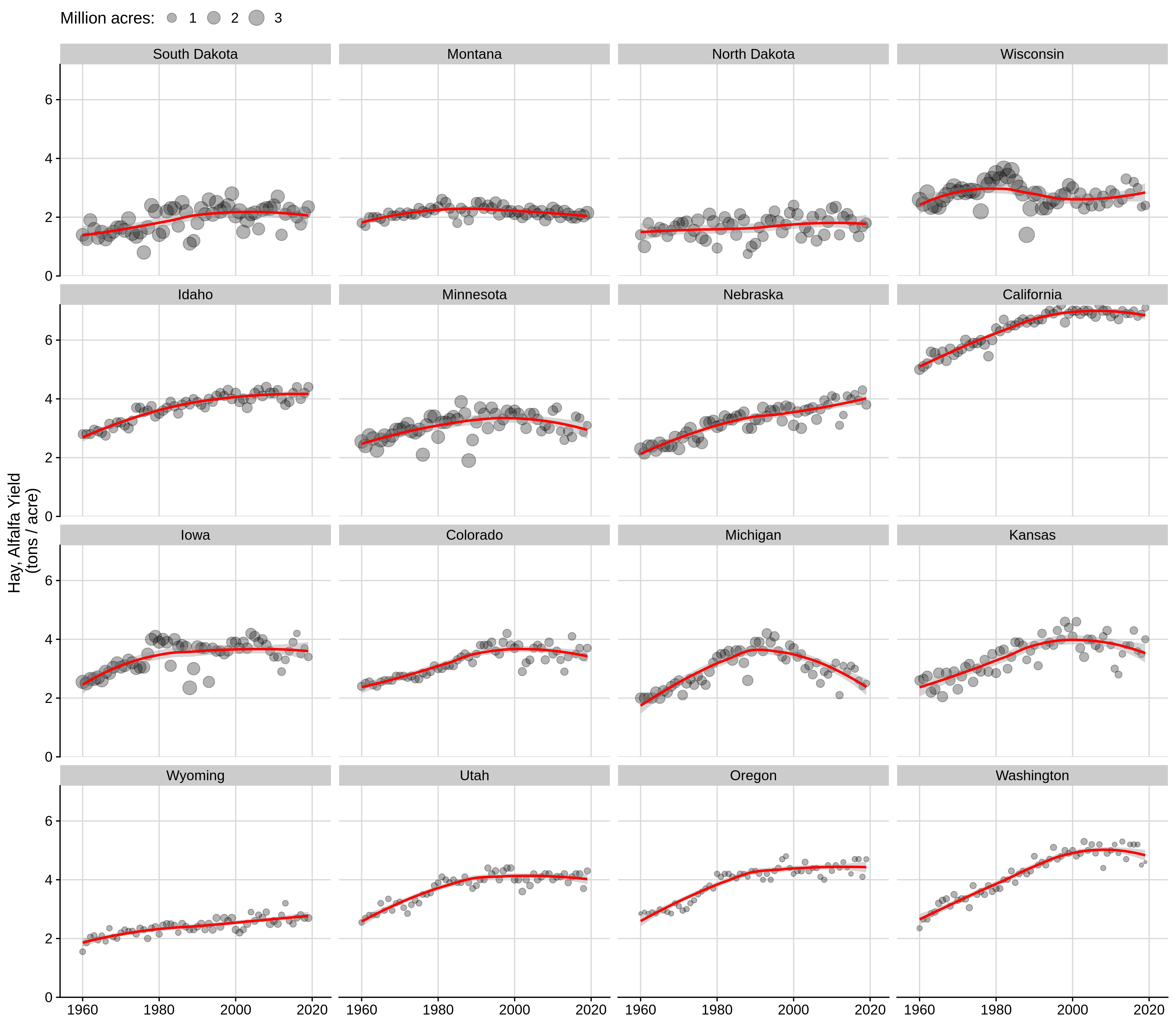
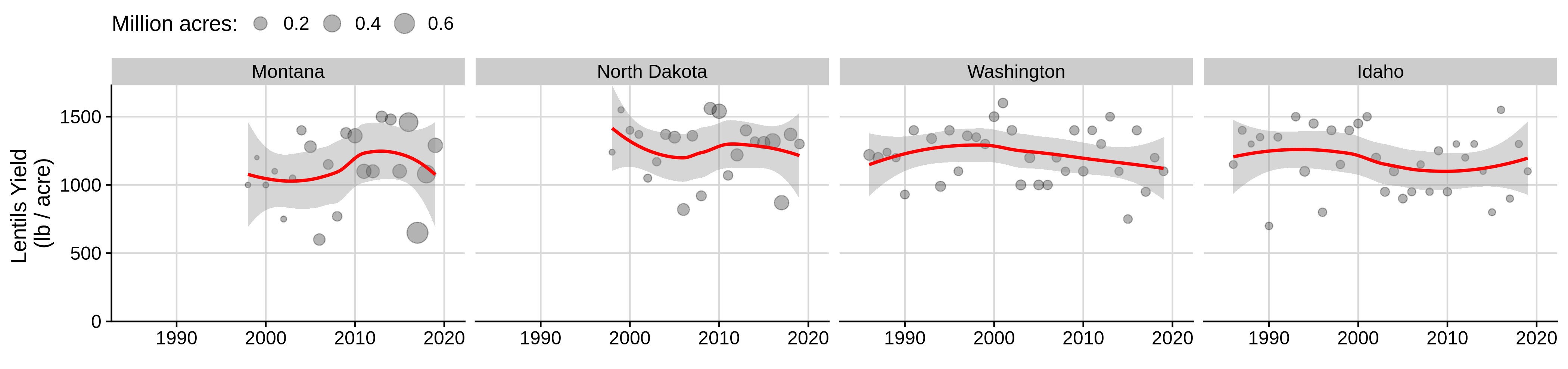
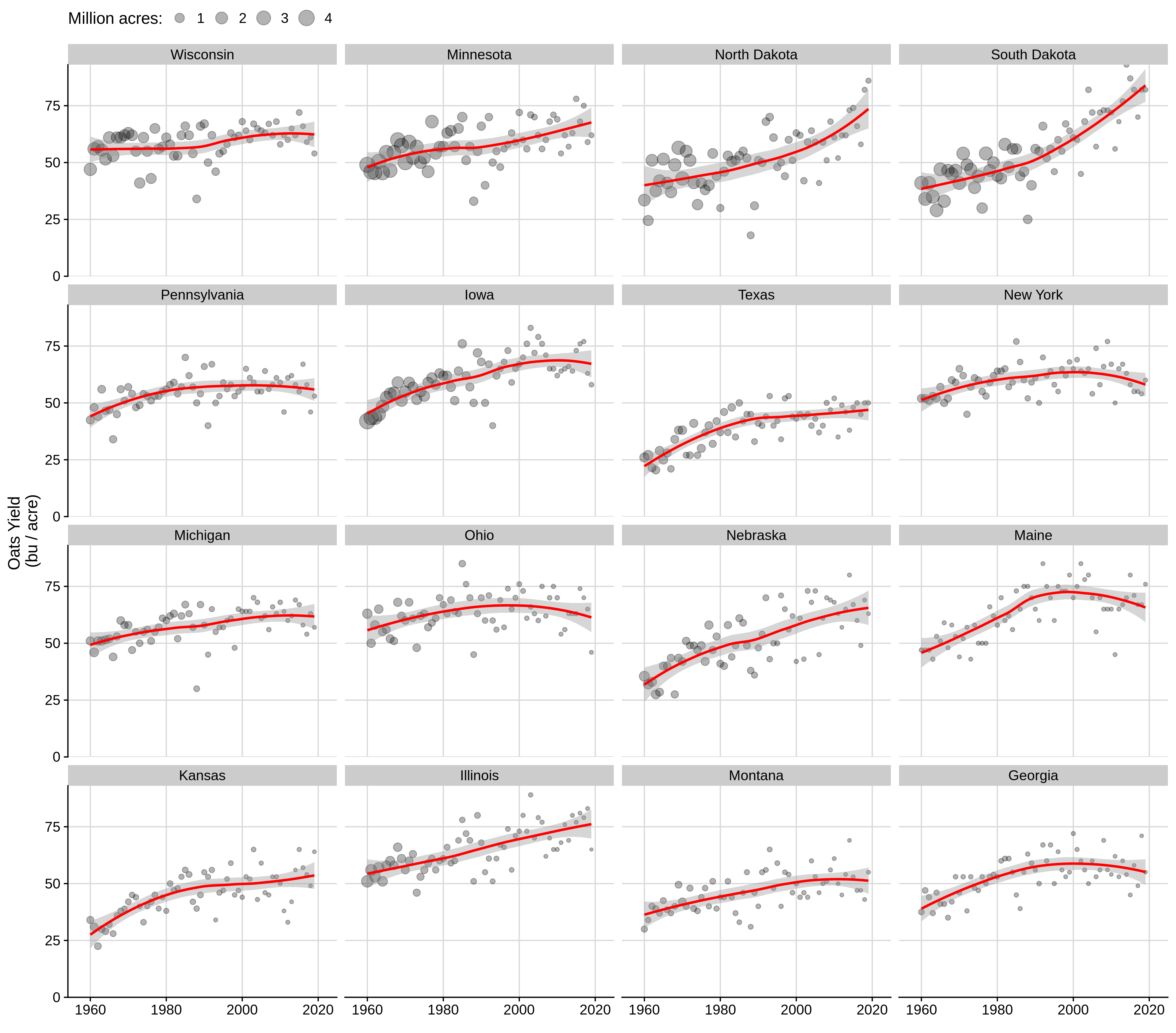
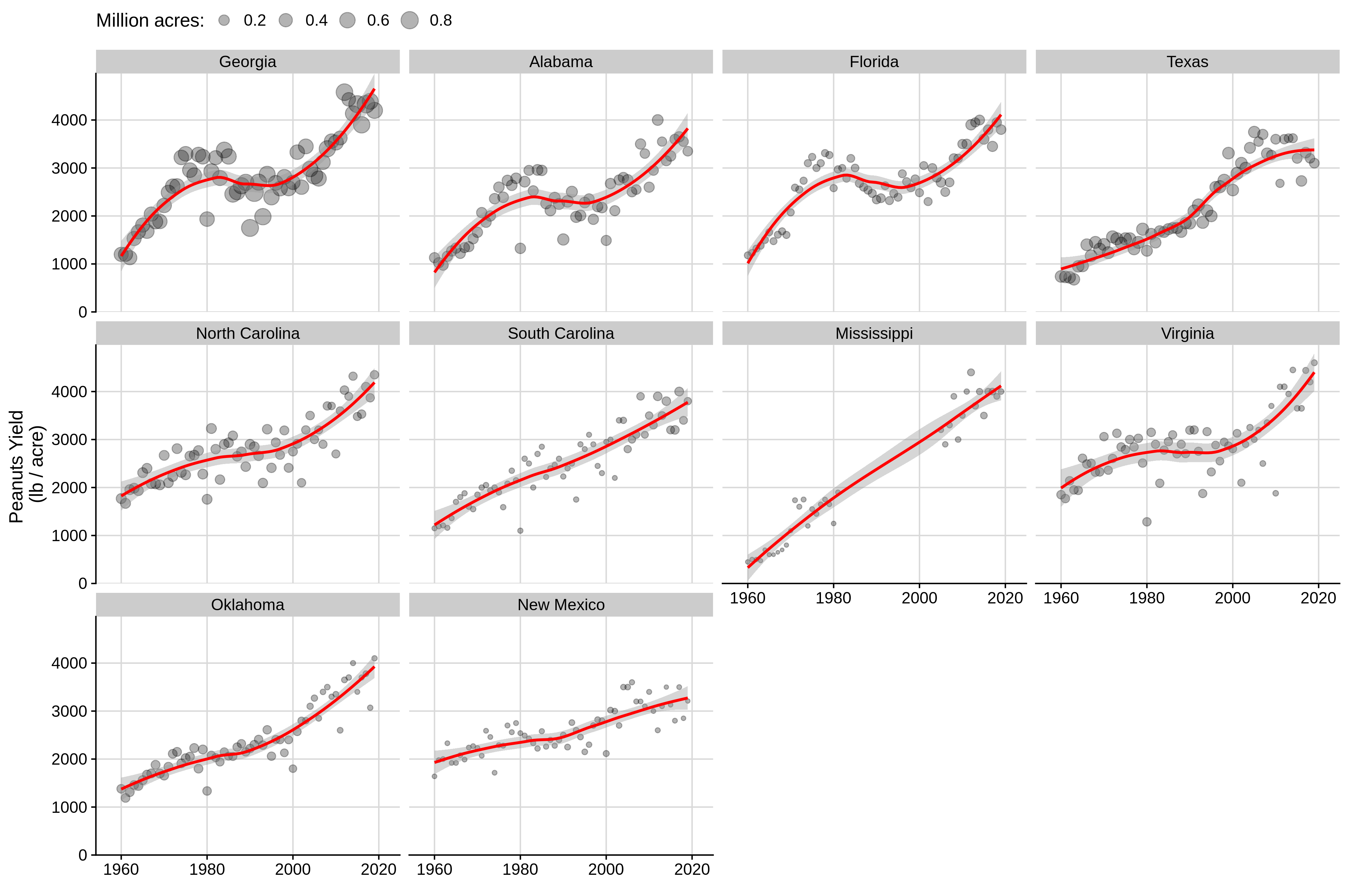
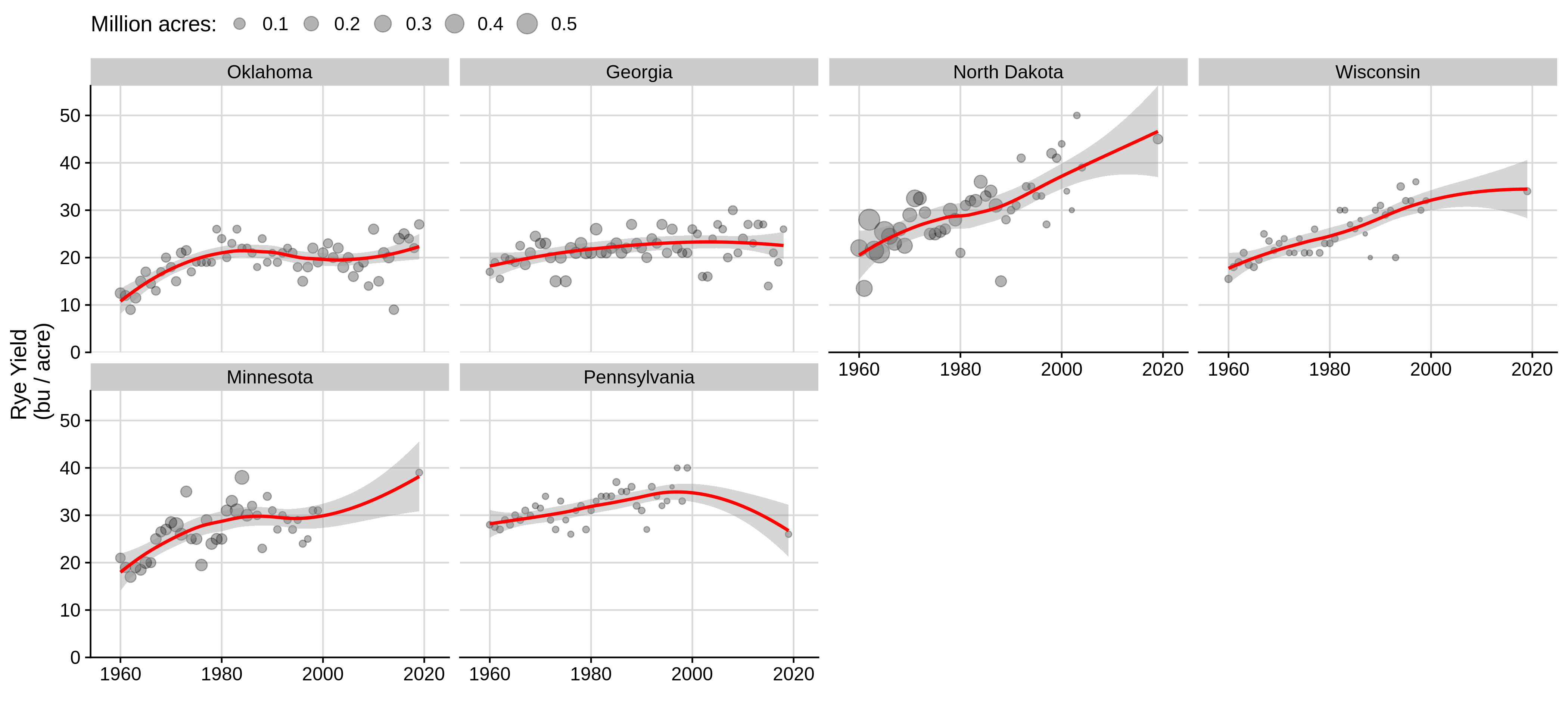
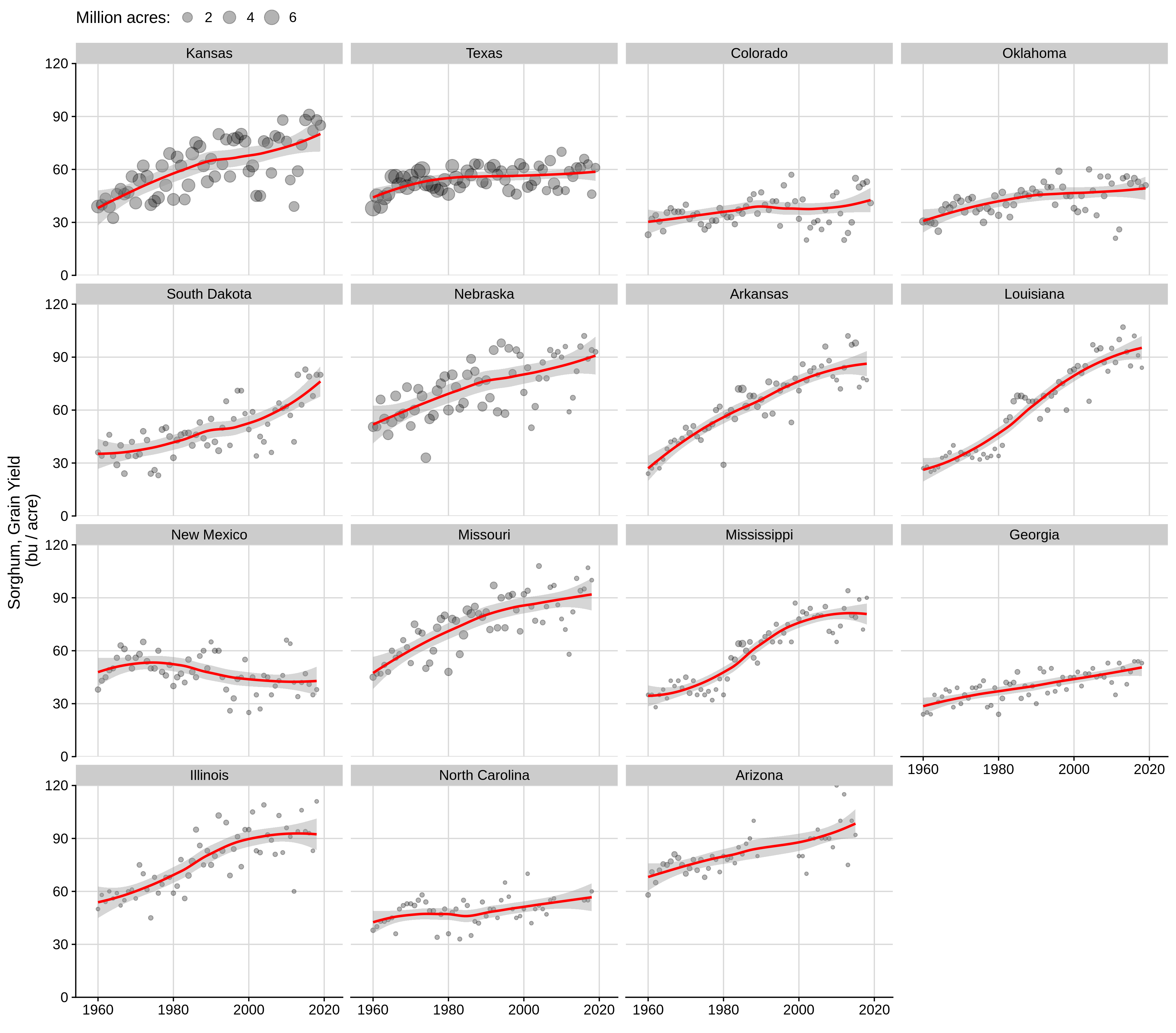
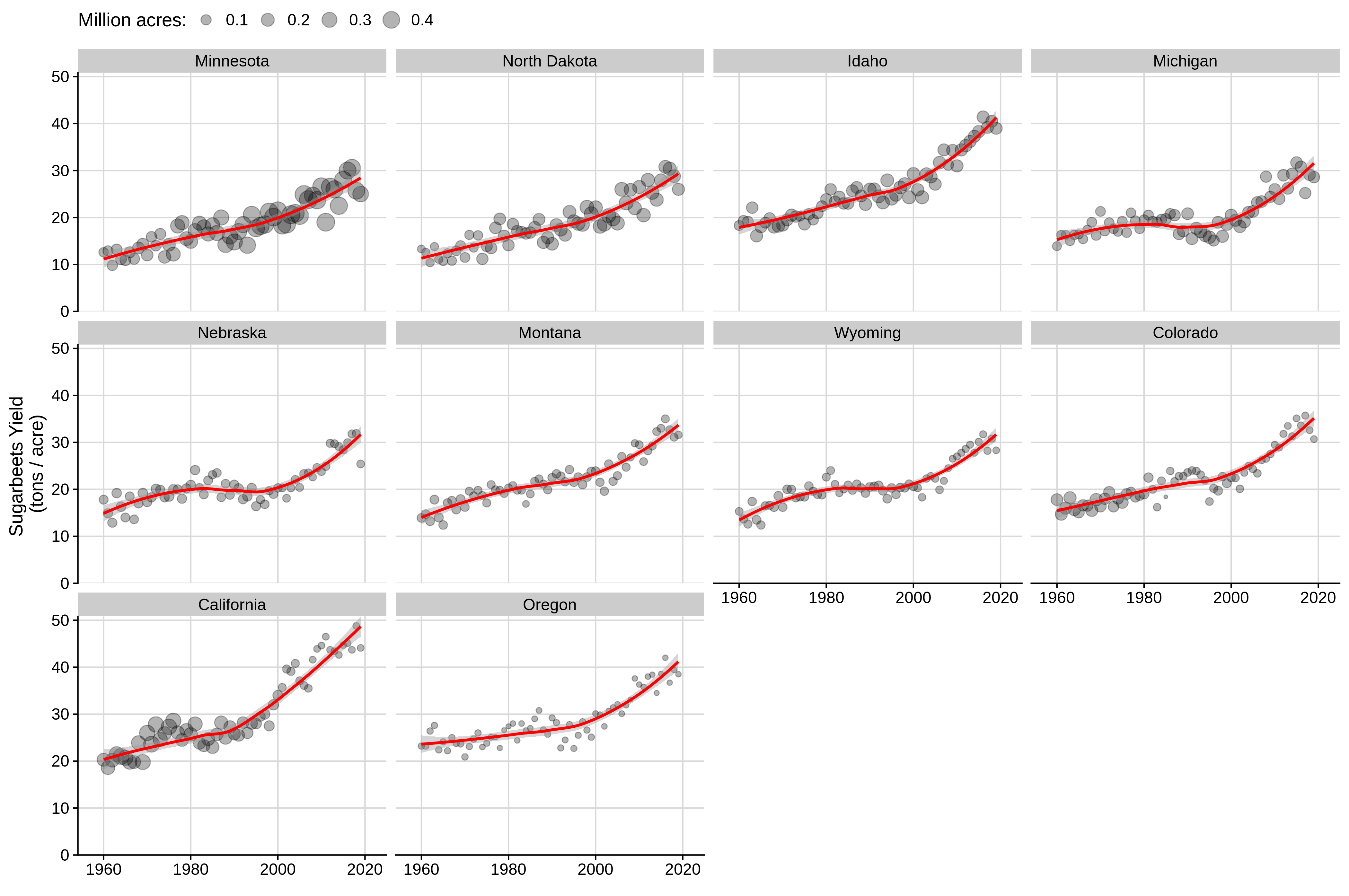
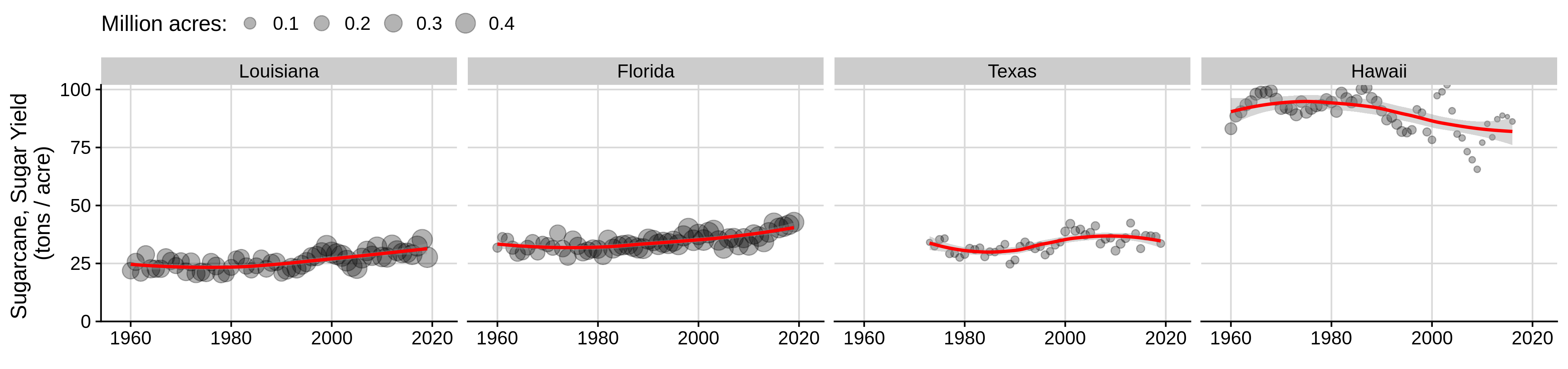
In the remaining figures, crop acres are represented by the size of the point; larger circles mean more acres, smaller circles mean fewer acres. Red line is the state-level yield trend.
Barley:
Beans:
Canola:
Corn (maize):
Cotton:
Alfalfa hay:
Lentils:
Oats:
Peanuts:
Rice:

Rye:
Sorghum:
Soybeans:

Sugarbeets:
Sugarcane:
Sunflower:

Tobacco:

Spring wheat:

Winter wheat: